
For this hashtag-Throwback-Thursday, I’d like to bring up a time a month or so ago where I ran into a very unusual (and annoying) CSS issue. However, it changed how I designed my sites from now on… and made me a little more skeptical of the vw unit, and viewport units in general.
First: Some History
Viewport units were originally introduced in the September 6th, 2011 working draft of the CSS Values and Units Module Level 3 to allow more precise control over positioning and sizing relative to the browser viewport — the visible area of a user’s screen, not including browser chrome. Originally there were three units defined: vw for 1% of the viewport width, vh for 1% of the viewport height, and vm for the smaller of the two. vm was changed to vmin for the March 8th, 2012 draft, but not before Microsoft adopted the old vm unit for IE9. The vmax unit (for the larger of vw and vh) was then added in the August 28th, 2012 draft, which is where we’re at today. Microsoft still has yet to implement anything like vmax, though it is on their Edge roadmap as of this writing.1
Because I love tabular data, here’s when each browser supported viewport units by version number and release date. This can help give us insight into how we got here:
| Browser | Units | Version | Release Date |
|---|---|---|---|
| Internet Explorer | vw vh vm |
9 | |
| Chrome | vw vh vmin |
20 | |
| Safari | vw vh vmin |
6 | |
| Safari | vmax |
6.0.3? | |
| Firefox | vw vh vmin vmax |
19 | |
| Chrome | vmax |
26 | |
| Opera | vw vh vmin vmax |
20 |
Originally, the viewport units were a bit ambiguous as to whether they should take scrollbars into account — that is to say, there was no explicit mention of scrollbars. From the August 28th, 2012 draft:
The viewport-percentage lengths are relative to the size of the initial containing block. When the height or width of the viewport is changed, they are scaled accordingly.
In debating what would become the April 4th, 2013 draft, there was a point of contention over whether or not viewport calculations included a vertical scrollbar, should one exist at the root element. The general consensus was that web developers shouldn’t depend upon the presence or absence of a scrollbar when building sites. However, a few respondents were concerned developers would instead rely on tricks like adding right-side padding to offset the scrollbar width in their layouts.
Though their objections were acknowledged, the viewport entry explicitly includes the scrollbar width/height depending on its overflow value:
[W]hen the value of ‘overflow’ on the root element is ‘auto’, any scroll bars are assumed not to exist. Note that the initial containing block’s size is affected by the presence of scrollbars on the viewport.
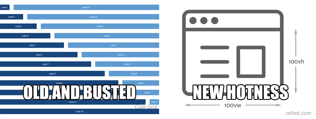
When viewport units were first released they were hailed as cool and awesome. Finally, web developers and designers can position DOM elements in the viewport with more consistency, especially for ever-troublesome vertical positioning. They were even more groundbreaking when used as font sizes because unlike every other unit of measurement available, the values aren’t relative to the base font size. Combined with @media queries, they make responsive and mobile-first design much easier. Combined with flexbox, fixed-pixel grid layouts like 960.gs were obsolete. Turns out you can do some pretty cool stuff with them, but the user is able to control the ensuing layout to a degree.
In short, they gave programmers much more control in some areas of site design while relinquishing control in others, but were still a welcome addition.
Header-ache
Naturally, I made liberal use of them when designing the latest Active 20-30 site, but I soon ran into a problem. I gave my sticky header a width of 100vw that was position: fixed at the top of the page, but any vertical scrollbar that appeared on the page overlapped the header’s right side. Here was the original CSS:
header {
    position: fixed;
    width: 100vw;
    height: 3.125rem;
    background-color: hsl(240, 100%, 20%);
    color: hsl(0, 0%, 90%);
    text-align: left;
    padding: 0;
    margin: 0;
    display: flex;
    justify-content: space-between;
    z-index: 100;
    font-family: 'Lato', sans-serif;
}
I researched a couple of possible solutions, but I finally found one in a StackOverflow thread that didn’t involve JavaScript or nested containers. I was pretty stupefied at its simplicity: Change width to 100% instead!
header {
    position: fixed;
    width: 100%;
    height: 3.125rem;
    background-color: hsl(240, 100%, 20%);
    color: hsl(0, 0%, 90%);
    text-align: left;
    padding: 0;
    margin: 0;
    display: flex;
    justify-content: space-between;
    z-index: 100;
    font-family: 'Lato', sans-serif;
}
Once I did, my problem went away — the right-hand side of my header was no longer covered by the scrollbar! Woo! Also as expected, 100% behaved the same as 100vw on pages that didn’t need a vertical scrollbar.
Calculations and Caveat-ception
The reason this works lies in the spec and how a browser calculates an actual (that is, pixel-unit) value for the element. Sayeth the viewport unit spec:
The viewport-percentage lengths are relative to the size of the initial containing block.
Percentage values are always relative to another quantity, for example a length. Each property that allows percentages also defines the quantity to which the percentage refers. This quantity can be a value of another property for the same element, the value of a property for an ancestor element, a measurement of the formatting context (e.g., the width of a containing block), or something else.
Viewport units refer to the initial containing block, and percentages refer merely to a containing block. The initial containing block behaves like a root element that surrounds the <html> element, since an <html> element can be styled and sized independently of the viewport and won’t be partially cut off by a vertical scrollbar at its default width. This essentially means that 100vw represents the full width of the containing block before it was resized to accommodate a scrollbar, and 100% represents its full width after. Therefore, this caveat also has a caveat: It only works at the root level2.
This CodePen demonstrates the original problem, its solution, then the solution applied to two other divs to show its limit:
See the Pen 100vw vs. 100% by Jonathan Ledbetter (@jledbetterpdx) on CodePen.0
100vw vs. 100% #Other Solutions
The original viewport-scrollbar debate implied that setting the html element to have an overflow-y of "scroll" will make 100vw = 100% on the root element, scrollbar or no:
/**
 * Choose a sane box model
 * https://css-tricks.com/inheriting-box-sizing-probably-slightly-better-best-practice/
 */
html {
    box-sizing: border-box;
    overflow-y: scroll;
    width: 100%;
}

*, *:before, *:after {
    box-sizing: inherit;
}
Unfortunately, this has the added effect of always having a right-hand scrollbar, which can look uuuuugly depending on the layout. Definitely not ideal for our situation. Single page apps, however, can adapt this method by changing overflow-y to "hidden" instead.
The above method is simply to avoid the scrollbar affecting the calculations altogether. To actually find the width of the scrollbar, you’d need to use this in CSS3:
width: calc( 100vw - 100% );
or in JavaScript ($element = any scrollable element):
var scrollBarWidth = $element.offsetWidth - $element.clientWidth;
However, if you’re looking for a challenge, there are other, more convoluted methods by which to calculate scroll bar width.
In Conclusion
Viewport units are great. I still use them in my code. But from now on, I look to avoid situations where a scrollbar can ruin a good layout by using percents a little more frequently than before. So far, I’ve found changes to the 20-30 site design that involve width or positioning are a bit easier to implement consistently using this method. I think I’ll stick with it until some other new hotness comes along.
Further Reading
- Sitepoint Forums, “100vw and scrollbars”
Endnotes
- I’ve also seen mention of two other viewport units,
viandvb, for 1% of the viewport unit in the direction of the root element’s inline and block axes respectively. Bugs were filed at Mozilla, Chrome and WebKit for inclusion. Alas, support was postponed until CSS Values and Units Level 4. - or in situations where the width of the containing block equals that of the root level
- again, root level or equivalent only