
One of the things I often see sites struggle with is having consistent, coherent menus across devices and orientations. Our site is no different, so it’s something I keep in mind when working on this redesign. Many variables go into making a good menu, and I’ve found that there is no good one-size-fits-all – you need to look at what you need and build accordingly.
When the current site was initially built in 2013, I decided upon a text-based menu. Each item is in Small Caps with no icons, next to a couple social media icons. While it serves its functional purpose, it nonetheless has a few problems:
- It’s not mobile-friendly at all – menu items are too small to interact with on mobile in their current form.
- This is a flaw of the site overall, but it heavily impacts menus.
- Adjusting the underlying site to show the text at a more normal size (i.e.
<meta viewport>) would make the text run offscreen. - There is little room for expansion, even on desktop browsers, without expanding header width, which is tied to site design.
- Menu items had already been reduced to combine similar functions into the same page.
- The 2013 site doesn’t include links to pages like special events or club documents, which will need to be added in the future.
- The layout and design are a bit stale, coming straight outta 2012.
Once I started redesigning the site in 2016, I decided to revisit the menus from a pro-mobile standpoint, coming up with these necessities:
- A pull-out “hamburger” menu to show/hide the menu.
- Icons for visibility and style.
- Large buttons, to reduce mis-clicks.
- The ability to accommodate 8+ menu items and a social bar comfortably.
Those first three things are relatively easy to handle with a bit of JS and CSS. Hell, I’ve seen all-CSS hamburger style menus that used <label> and a hidden checkbox to determine the open state. The fourth thing… well… can be tough to get right when dealing with vastly different screen sizes.
The first menu I came up with looked like this:
And it worked!
Sort of.
As I tested the site and let the menu design simmer in my brain, I started revisiting it more and more. Despite the fact that it met my basic criteria, and while it was an improvement over the previous version:
- The icon sizes were too small on mobile, and too large on desktop.
- It was a pain getting the text, icon and padding to line up across devices and orientations (probably due to the 100% vs 100vw issue).
- Menu items were stretched in landscape mode.
- Rearranging items based on the above three points would’ve resulted in icons or text being pushed outside the item bounds.
- Right-aligned hamburger menu doesn’t appear consistent with apparent standards.
- It looked too corporate – too much like Windows 8 Live Tiles.
- The slide-out menu looked hokey on desktop.
- Though it was meant to be temporary, I was nonetheless struggling on determining how to properly arrange it.
In short: It just didn’t fit in.
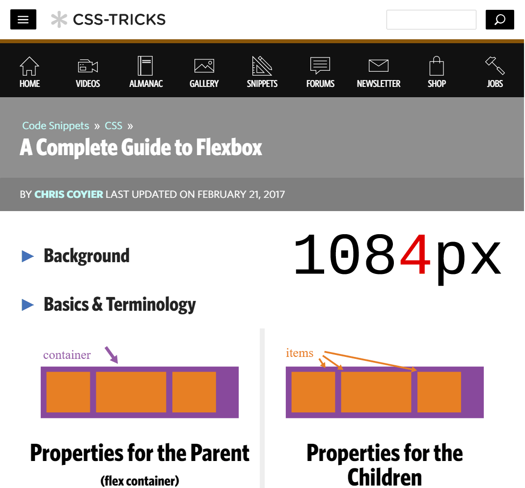
So I went back to the drawing board and remained on the lookout for a site that had an interesting way of laying out their menus. Fortunately for me, CSS Tricks, I site I frequent, made a recent site change that included a functional and visually appealing nav menu. Let’s see the desktop version first, using their Complete Guide to Flexbox as an example page:
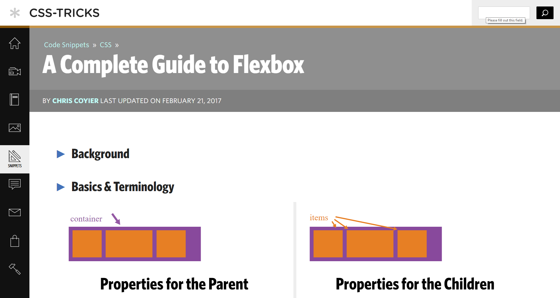
I really like this design, first and foremost, for how it handles large numbers of icons. The desktop version puts its menu flush left, with nine large SVG icons always visible. However, each menu is accompanied by labels that fly in from the left when you hover over them; hovering also changes the icon’s fill color. An addition to the white-on-black contrast, the font used for the labels is very thin, yet with a thick enough stroke to stand out. (There’s also a “highlighted item” state which inverts the color scheme of the menu item to which the current page belongs. That functionality is out-of-scope for this particular article, but I may work it into the menu at a later date.)
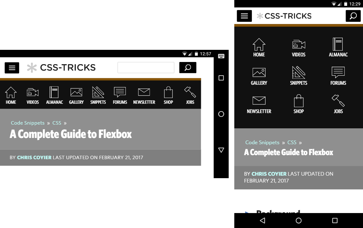
The mobile version hides these menus behind a hamburger icon like mine does, but eschews with animation to simply make the menu appear, which makes it much less gimmicky-looking. Unlike on desktop, the menu is attached at the top; also, because you can’t exactly “hover” over menu items on mobile, the labels are always visible. The landscape design places the items in one long row, while portrait mode puts them in a 3×3 grid. Neither layout highlights the current page section.
After seeing this menu in action, I decided to steal re-create it for 20-30’s site. While I’m planning to arrange the menu items the same way (3×3 grid, single row, single column), they won’t be implemented the same way.
Breakpoint Breakdown
I investigated their CSS to determine the layout-switching breakpoints they used: 625px and 1085px1. In a pretty table, they look like this:
| Pixels | Menu Layout | Target Device/Orientation |
|---|---|---|
| ≤ 625 | 3×3 grid, from top | Mobile portrait |
| 626 – 1085 | Single row, from top | Mobile landscape, tablet |
| ≥ 1086 | Single column, on left | Desktop, tablet |
Using Chrome’s handy device toolbar dev tool, I threw the viewport dimensions for these OS’ in another pretty table:
| Device | Short Side | Long Side |
|---|---|---|
| Galaxy 5S | 360 | 640 |
| Nexus 5X | 412 | 732 |
| Nexus 6P | 412 | 732 |
| iPhone 5 | 320 | 568 |
| iPhone 6 | 375 | 667 |
| iPhone 6 Plus | 414 | 736 |
| iPad | 768 | 1024 |
| iPad Pro | 1024 | 1366 |
Thus, here’s how the layouts would be applied on CSS Tricks per device:
| Device | Portrait | Landscape |
|---|---|---|
| Galaxy 5S | Grid | Row |
| Nexus 5X | Grid | Row |
| Nexus 6P | Grid | Row |
| iPhone 5 | Grid | Grid |
| iPhone 6 | Grid | Row |
| iPhone 6 Plus | Grid | Row |
| iPad | Row | Row |
| iPad Pro | Row | Column |
Aside from wide desktops, an iPad Pro held in landscape mode is the only device that would ever see the menu on the left. Tablets can easily see all the icons on one row or column, regardless of mode. Otherwise, there was a consistent portrait/landscape split across phones, save the iPhone 5 with its dinky 320×568 resolution.
Here’s where site audience comes into play. CSS Tricks caters to fellow programmers, developers and software engineers. Our goal is attracting potential members, sponsors and partners while promoting our events and deeds. Because our audience isn’t as tech-savvy as CSS Tricks’, we don’t need to cater to a wider variety of devices – and therefore, we only need to focus on a small set of resolutions. We don’t need to have our column breakpoint as wide as theirs.
I decided on 624px and 864px – or 39em and 54em respectively, since I use em units for @media breakpoints [ems vs rems]. Here’s how mine break down by device/OS, with differences highlighted:
| Device | Portrait | Landscape |
|---|---|---|
| Galaxy 5S | Grid | Row |
| Nexus 5X | Grid | Row |
| Nexus 6P | Grid | Row |
| iPhone 5 | Grid | Grid |
| iPhone 6 | Grid | Row |
| iPhone 6 Plus | Grid | Row |
| iPad | Row | Column |
| iPad Pro | Column | Column |
It’s the same, except basically the iPad gets to see my columns more often. Close enough for government work. On to making the menu itself!
Good Artists Copy
After my investigation, I wrote the CSS itself from scratch so that it would mesh well with the design updates I was already working on. That, and I just didn’t want to wade through 7,500+ lines of CSS to extract their code. I did adjust my layout on how they set their menu up:
- The menu and main content are wrapped in a single contained below the header.
- The left-hand/desktop menu is 100px wide.
- The menu labels use a narrower font.
We both use flexbox to align our items with a nav menu above our main content, but using different effects. CSS Tricks used the flex shorthand property and wrapping to force the content below on mobile, while I set flex-flow to column nowrap for mobile and row nowrap for desktop using standard CSS width declarations. (I may eventually switch over to using flex to handle width, but will keep column nowrap as I feel it’s more semantically-correct.)
I departed even further from CSS Tricks with my hover effects. Because 20-30’s site is more colorful overall, the icon color-changing effects would get lost on our site, so I dropped that part. CSS Tricks also lowers the icon on hover using a translateY(), whereas I raise it. I also adjusted the effect from a translateX() left fly-in to a simple opacity fade. Lastly, I added a quick CSS declaration that makes the label of the hovered menu item appear first, with the opacity cascade to follow.
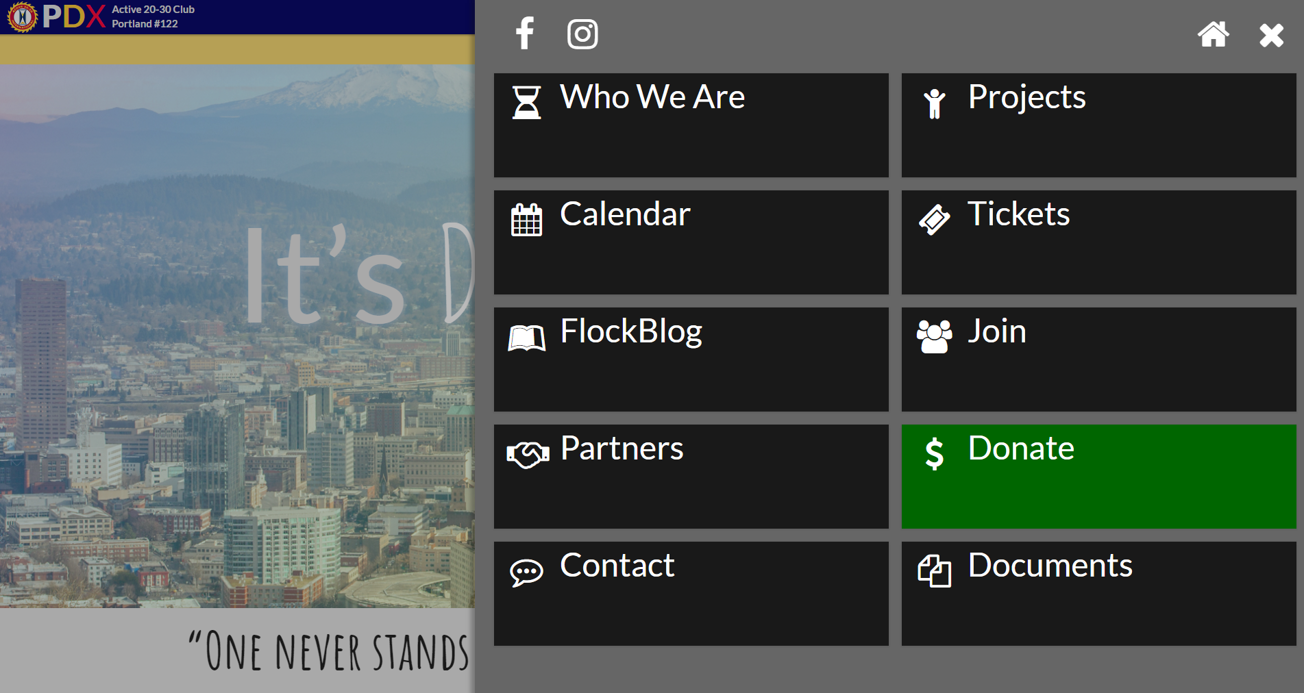
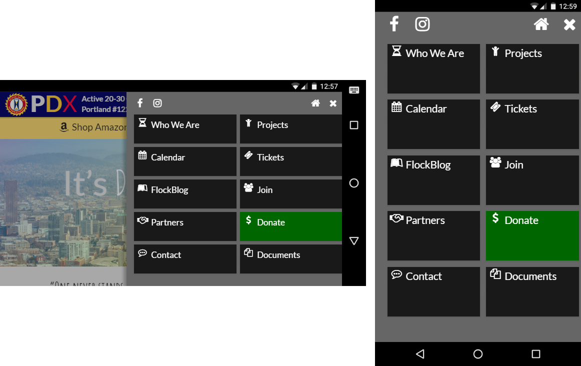
One aspect I kept from my first menu design was coloring the “Donate” button green to draw attention to it. It’s always colorized in the mobile designs, but I thought it would look tacky on desktop, detracting from its impact. There, I decided instead to only show the green color on hover, where it would still be impactful, but not garish and in-your-face. I also toned down the green a little bit from the original, and placed it dead center to increase visibility.
But Wait! What About That Social Bar?
Since 20-30 relies more on social media presence than CSS Tricks appears to, it makes sense to put links to our social pages above-the-fold somehow, somewhere. For the desktop and mobile landscape views, I placed them in the header on the right, always visible. However, the mobile portrait view hides them inside the dropdown nav menu as a second (technically fourth) row of icons; the header icons kept running into the header text, making the dimensions all wonky. It admittedly isn’t the best UX decision to split up where the social media icons end up, but sometimes you can .
And Those Fonts and Icons?
CSS Tricks uses SVG icons and Whitney Condensed transformed to uppercase for its menu items. The font I originally used, Lato, was too wide and corporate-looking for the site. However, Amatic SC, a thin handwriting font I use for hero images, fit the bill perfectly, looking good at small sizes while hipsterizing the menus appropriately. I kept the FontAwesome icons from the original 2016 redesign instead of creating or finding SVGs – though implementing them is something to keep in mind for a future upgrade.
Voilà!
With all the components assembled, here’s how the desktop menu turned out:
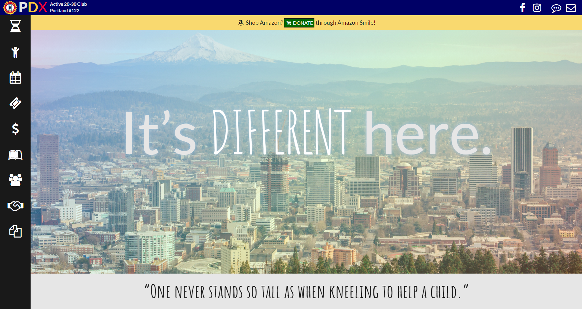
and the mobile menus:
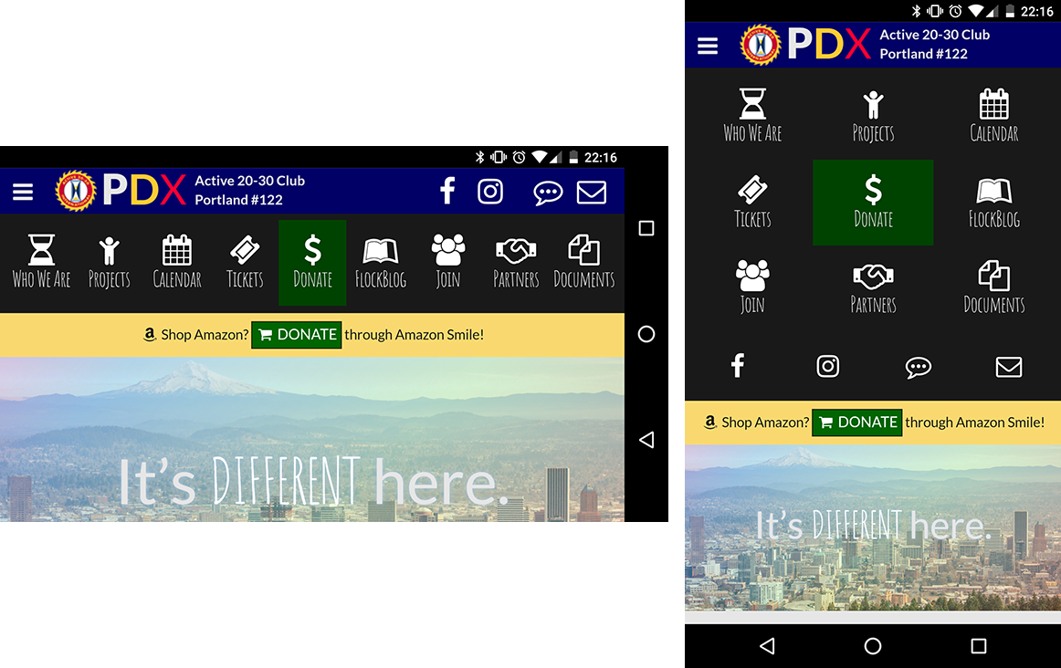
Now, this isn’t the last change to the ol’ menu. I’ll be making more tweaks for accessibility and ease-of-use. I may tweak this and that, but for now it’s functional, it’s slick, and it’s sized properly on desktop and mobile clients — just what I was going for.
Endnotes
- CSS Tricks’ CSS contains a bug when the viewport is exactly 1085px. The stylesheet applies the label fly-in to the
<span>tags usingmin-width: 1085px, whereas every other@mediafor that breakpoint usesmax-width: 1085px;. It looks a little funky.